
The Thermodynamics of Covid
Covid-19 data provided by the New York Times is used to calculate important thermodynamic quantities for Covid-19 infections (as a non-equilibrium process), such as the Free Energy. The Free Energy is the energy available to drive infection.
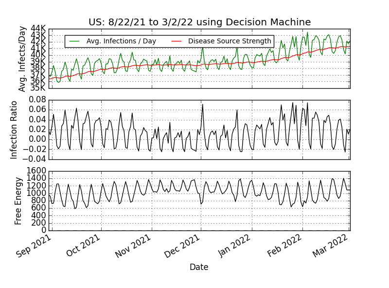
The plot above is the historical record of Covid infections and deaths in the United States provided by the New York Times (through their API). What is most noticeable from the data in the top plot above, is that the reported infections “throb”. This behavior is not specific to the US—many cities and countries have the same dissipative behavior. From the top plot above, we also see that the US is not yet in recovery: the green curve in the last few weeks persistently jumps above the red curve.
The Covid coverage on the New York Times front page has changed from the manner in which they report measurements in the last Covid wave (Jan 2021). While the NYT’s API still supports daily tallies, the front page now only presents a 14-day average. The data reported as a 14-day average effectively removes the “throbbing” observed in the previous wave, the characteristic of any far from equilibrium (non-equilibrium) system. Not only does the averaging veil the actual propagation of the virus in our communities, it also produces a repeating and misleading picture when observed average infections are seen to be going down. For example, the media in New York City today (Jan 18, 2022) is holding out hope that New York City Covid has reached its peak because the average infections are falling. In a dissipative structure, the average must go down in preparation for a potential surge forward.
Let’s look at the state of affairs on March 2nd 2022 in New York City (see below) using the daily death toll data provided by the NYTs. We observe that the characteristic pulses of a Covid wave have attenuated and has entered recovery (below, top plot, bottom right hand: green curve is below the red curve). In addition, the middle plot for infection ratio confirms recovery for NYC, since it is consistently negative for the last two weeks. Many counties in the US are far from recovery.

Covid-19 data provided by the New York Times for NYC is used to calculate important thermodynamic quantities for Covid-19 infections (as a non-equilibrium process), such as the Free Energy, and their impact on the contagion.
Covid-19 Geiger Counter
Because of issues with Covid-19 testing, confirmed cases data can be misleading. The percentage of positive results as a percentage of testing is a good metric, but it too has been the subject of “truth decay” in the US. Deaths, however, can be counted with high confidence. Our objective is to use machine learning and deaths data to identify the strength of the infection source in the population, and the infection rate per day given the observed death toll and 3% mortality. The infection energy and the infection ratio metrics are independent of the mortality value. Note that it is not critical that the reported deaths are exactly correct. If our errors in counting COVID deaths is systematic, then the conclusions are the same.
Our results can be used to evaluate the effectiveness of public health measures, and help inform when and how they can be relaxed so that we can return to work, and the company of our extended family and friends.
The science and mathematics used here is nearly identical to the design and use of a Geiger Counter (that indirectly measures the strength of a radioactive source through ionization) and non-equilibrium chemical processes.
New Whitepaper Article: Science Strikes Back at Covid-19
Community Interest
All US Counties - 12/14/2020
New York City Community - 2/21/2021
Los Angeles Community - 2/21/2021
San Francisco Bay Area - 2/7/2021
Detroit Community - 2/7/2021
Global Interest
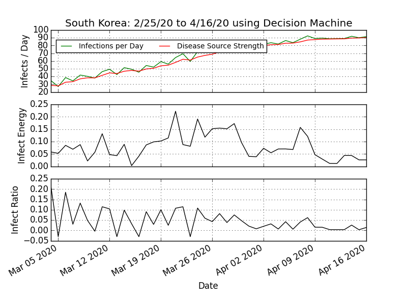
South Korea
South Korea saw very large infection ratios in December and early January. Significant improvement in the infection ratio was been seen recently, and a leveling off of the average infections per day. Recovery will be seen when the infection ratio drops below zero.

India
Population approx. 1.4 billion. India has reached a peak infection rate and is in an extended recovery. The negative infection ratio has been maintained. The Free Energy is relatively stable; well away from self-propelled infection (negative free energy).

Japan
Population approx. 127 million. The infection ratio has dropped to 0.15, and appears to be exiting the danger zone (above 0.15). Free energy increasing steadily, with persistent oscillations.
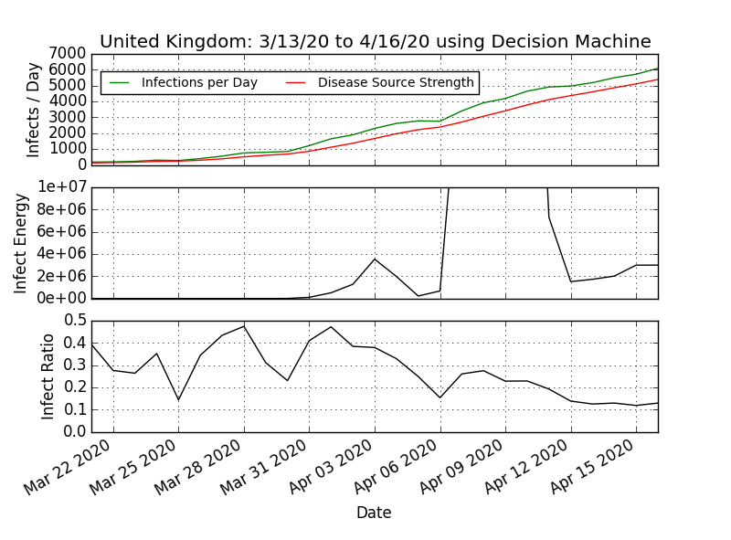
United Kingdom
Population approx. 67 million. Infection ratio has reduced significantly in the last two weeks, dropping well below the danger zone (greater than 0.15). However, increasing free energy values and large oscillations are still observed.

Belgium
Population approx. 11.5 million. Passed over a top. The infection ratio is signaling Recovery (negative values). Belgium is in Recovery.

Sweden
Population approx. 10 million. The infection ratio was alarming in mid-January, has moderated recently and is well out of the danger zone (greater than 0.15). Increasing free energy and oscillations are still observed. Recovery when the infection ratio is consistently negative.
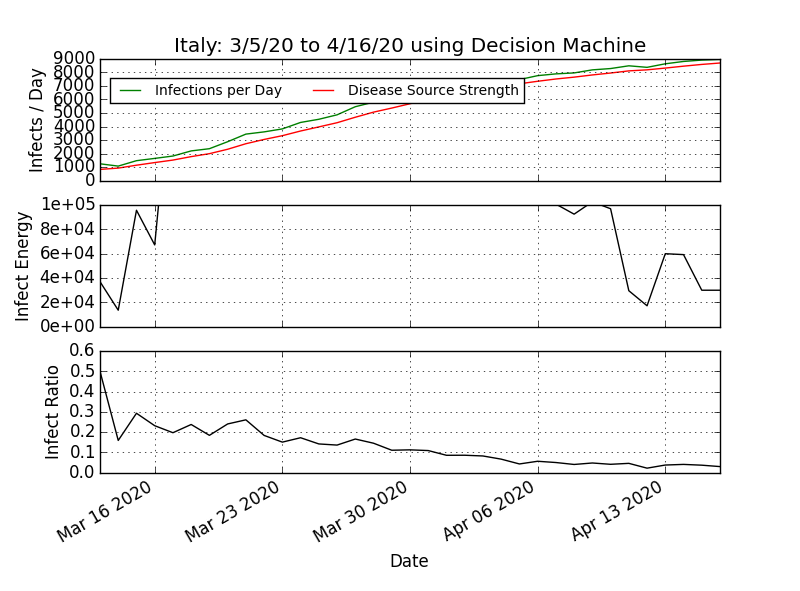
Italy
Population approx. 60 million. Italy is approaching a top. Increasing free energy, and oscillations in the free energy are still observed. To see recovery again, the infection ratio needs to be consistently negative.
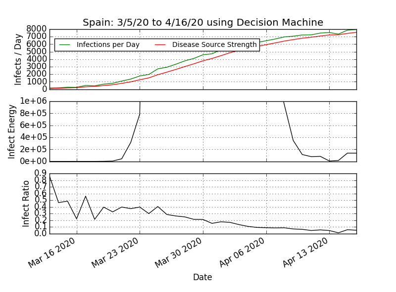
Spain
Population approx. 50 million. The infection ratio was very high, moderated (well below the danger zone of 0.15), but is increasing again. Oscillations in the free energy are observed, and have been large in the last two weeks. The curve is bending down, but is not near a top.

France
Population approx. 67 million. The infection ratio was very high, moderated in January, but is increasing again. Recent weeks have seen infection ratios moderate. Oscillations in the free energy are observed and are increasing in size.
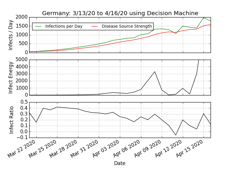
Germany
Population approx. 83 million. The infection ratio was alarmingly high in mid January, but has dropped in recent weeks. Large oscillations in the free energy are still observed, and the infection ratio peaks are still high (close to the danger zone, greater than 0.15).
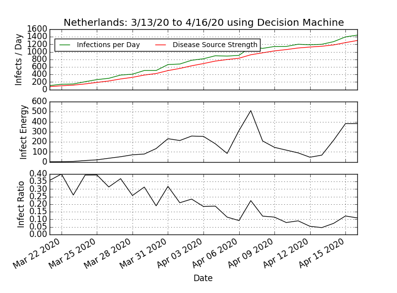
Netherlands
Population approx. 17 million. Infection ratio has dropped significantly from elevated levels. More free energy is available to cause infection, and oscillations in the free energy are still observed.

Mexico
Population approx. 129 million. The infection ratio spiked in early February, but has thankfully dropped out of the danger zone (greater than 0.15). Oscillations in the free energy are observed and still too large. Mexico was flirting with negative free energy, but has managed to move away from spontaneous infection.

Switzerland
Population approx. 8.5 million. The infection ratio has moderated in the last three weeks. Infection Ratio no longer in the danger zone (above 0.15). Oscillations in the free energy are observed, but are also moderating. Switzerland over a top, and will see recovery when the infection ratio is consistently negative,

Poland
Population approx. 38 million. The infection ratios were alarmingly high, but have dropped significantly in the last two months. Infection ratio now well out of the danger zone (greater than 0.15). Free energy observed to be increasing (more energy available for infection work), and the oscillations in the free energy are observed. The curve is bending down and a top is within sight.

Russia
Population approx. 147 million. The infection ratio continues to drop, but distant from recovery (negative infection ratio). Free energy observed to be increasing (more energy available for infection work), and oscillations in the free energy are still observed.

Ukraine
Population approx. 42 million. The infection ratios were very high. but have pulled back considerably from danger zone (greater than 0.15)—currently, touching 0.05. Free energy increasing (more energy available for infection). Oscillations in the free energy are observed, but appear to be moderating. Ukraine will see a top and begin recovery when the infection ratio is consistently negative.

Turkey
Population approx. 83 million. The infection ratios have dropped, but are still slightly positive. Turkey has a top in sight. Free energy is leveling off, and free energy oscillations still not observed When the infection ratio is consistently negative, Turkey will have reached a top and will begin their recovery.

Greece
Population approx. 11 million. May be approaching a top. The infection ratio has dropped significantly from very high values, and is approaching zero. Recovery is signaled by negative infection ratios. Free energy (energy available to do infection work) increasing slowly.

Israel
Population approx. 9.2 million. Infection ratio well out of the danger zone (greater than 0.15). Free energy increasing (energy available for infection work) and oscillations in the free energy are subdued but still visible.

South Africa
Population approx. 60 million. The infection ratio has dropped well below the danger zone (greater than 0.15), and the infections per day appear to be approaching a top Free energy has been increasing (energy available for infection), and moderate oscillations in the free energy are still observed.
Additional Technical Information

COVID-19 Detector design based on same science as a Geiger Counter (Hans Geiger, 1908). Infers Incidence and Infections.
Key reported metrics are designed to be independent of mortality.
The instrument uses a 3% mortality. Note that if the mortality were reduced by half (to 1.5%), then in order to achieve the death toll we observe, the source strength and infection rate would necessarily double. Therefore reducing the mortality for a given death toll implies more suffering and potential to contract the disease. Because there are variants with different infection rates, we have chosen to use a blended rate of 3% mortality.